"The goal was: Create an app used by someone who knows nothing about ticket ordering, and keep the interface clean + clear, + understandable."
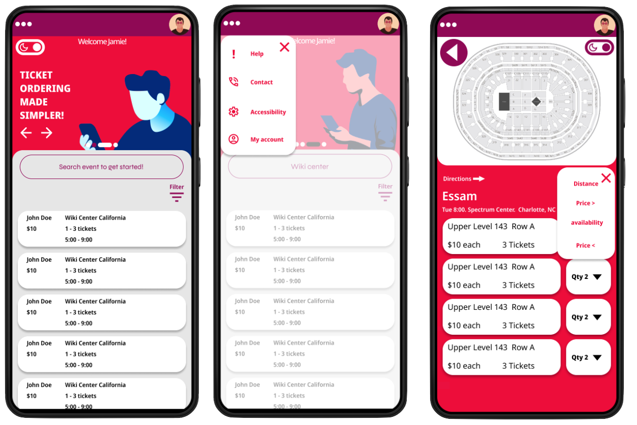
This is an app to order tickets in an appealing card based UI.
To start I came up with a hypothetical location for my user persona, Toronto Canada. I then considered, who would be the two most likely people who would want to attend a live venue
Finding a fast yet intuitive way to book a ticket is also quite a common issue.
Being unable to know where you will be sitting is also a pain point that many concert goers can relate to.
Price comparison of different seating layouts where not usually available.
Ads, scammers, and getting bombarded with ads that disrupt the ordering process is hard.
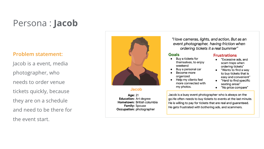
Problem statement: Jacob is a event, media photographer, who needs to order venue tickets quickly, because they are on a schedule and need to be there for the event start.
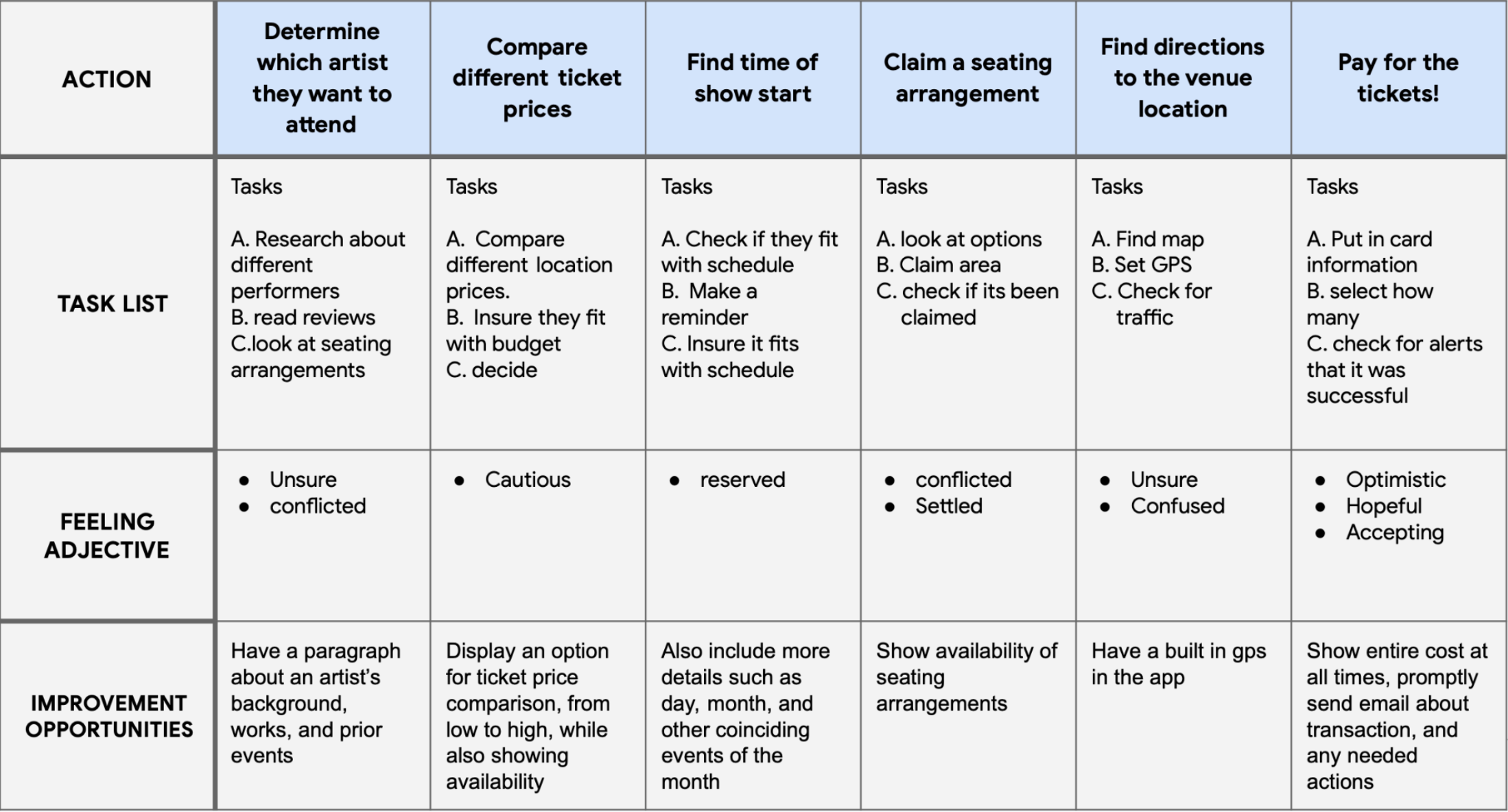
A journey map helped me uncover more hidden pain points, & break down the steps into bullet points which I could analyze, & implement into my design
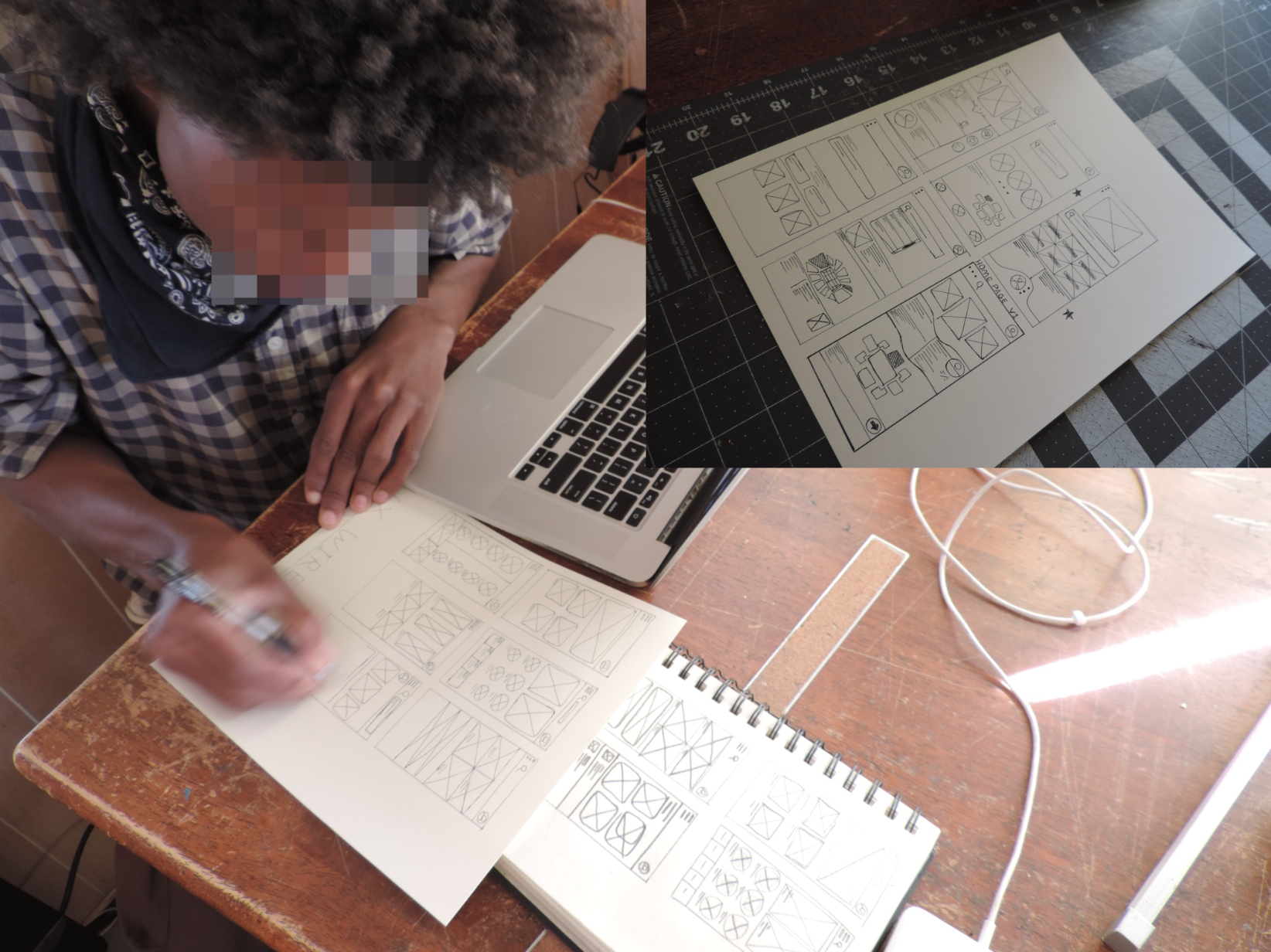
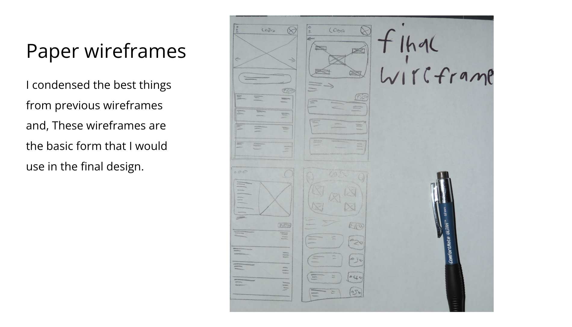
Using pen and paper I sketched down some ideas of what i thought would work well for the main pages. I drew many! Wireframes on multiple sheets, and condensed all the things I loved and tried to make one I would iterate on.
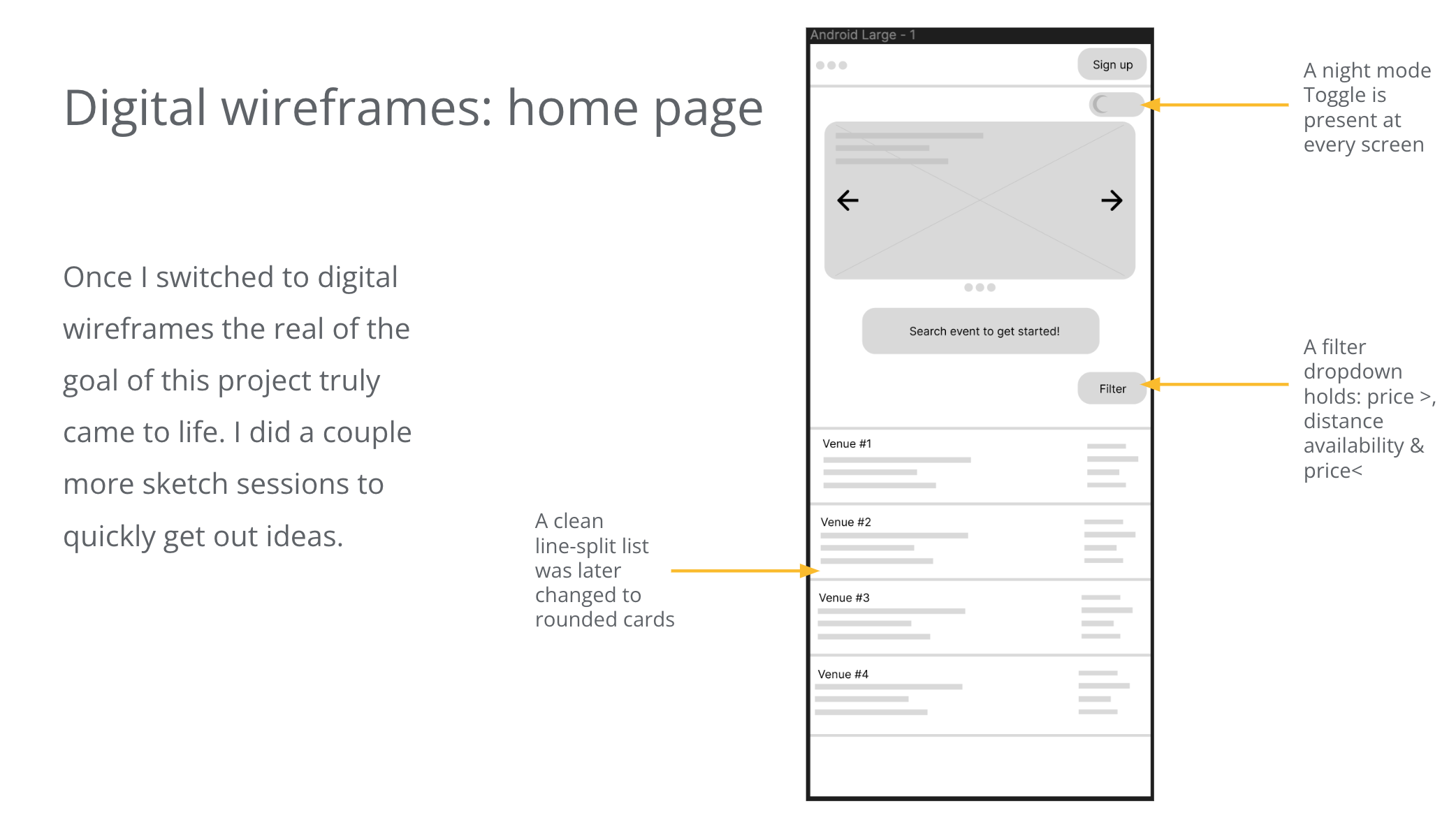
Once I switched to digital wireframes the real of the goal of this project truly came to life. I did a couple more sketch sessions to quickly get out ideas.
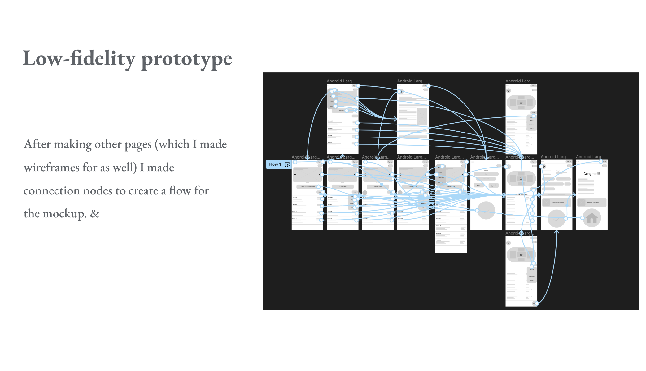
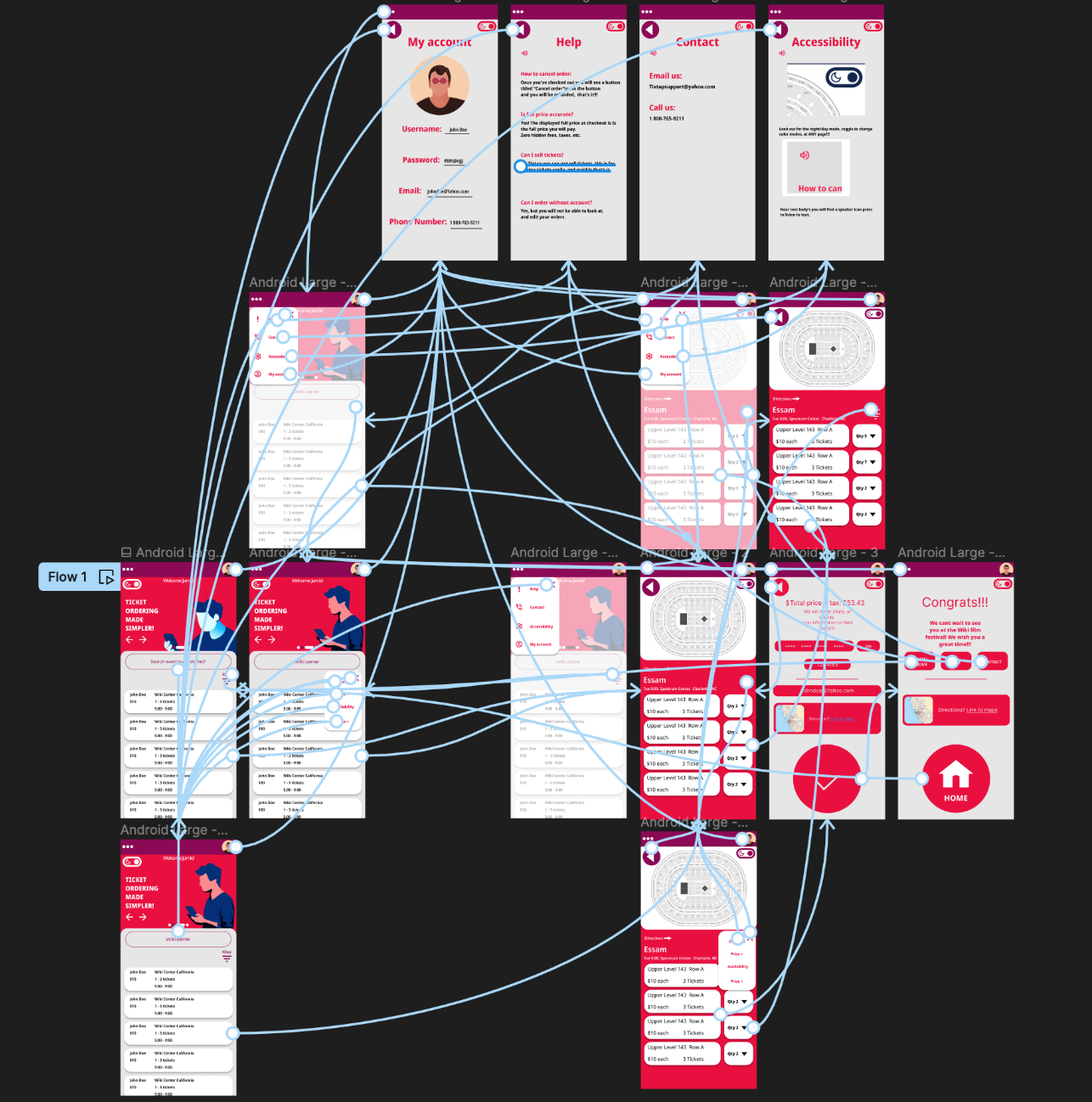
After making other pages (which I made wireframes for as well) I made connection nodes to create a flow for the mockup. &
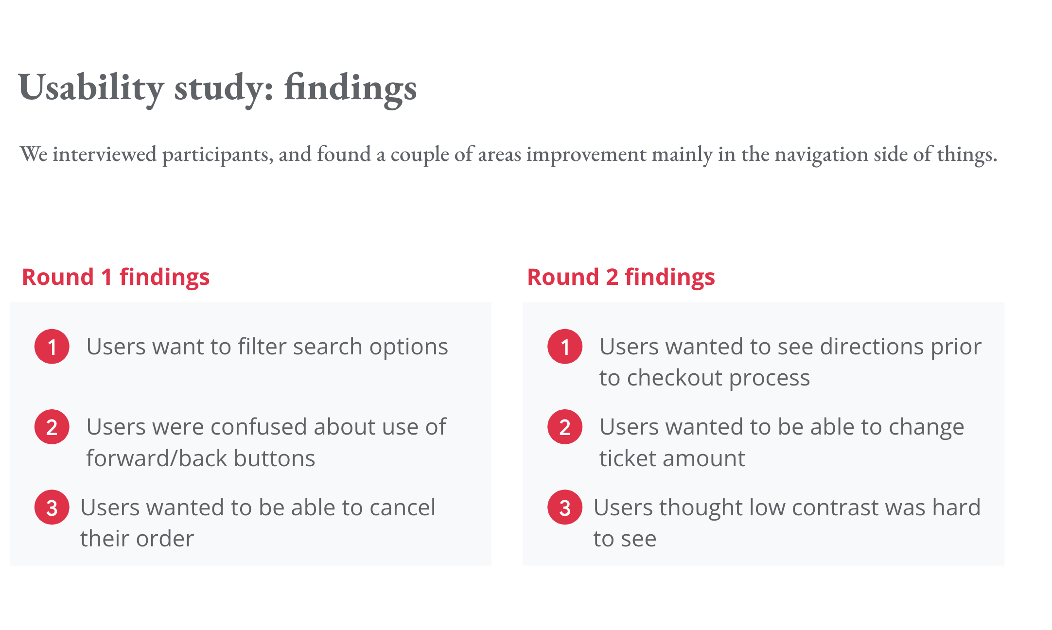
We interviewed participants, and found a couple of areas improvement mainly in the navigation side of things.
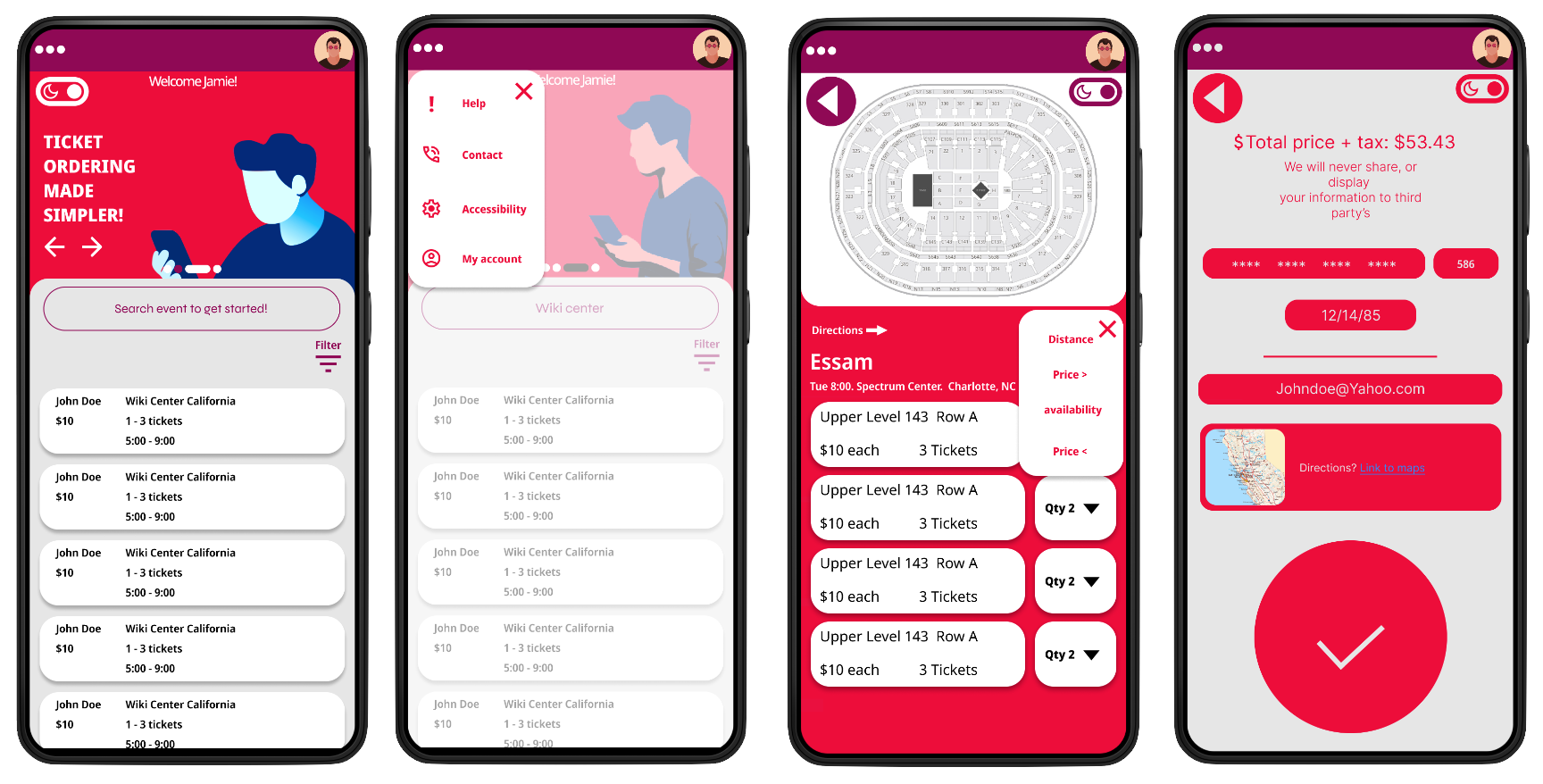
Accessibility is the first thing we considered as it is the backbone of a good User experience.
1. Every appropriate page features a simple toggle button which changes the Day/Night theme, to a darker theme or a lighter theme.
2. I insured that colors past the WebAIM contrast checker especially because of the the pallete I chose, Red/Purple/Gray
3. To preserve visual stability, all cards, popup windows, & border dividers have a consistent corner radius of 21Px
Email: Abdullahcanhelp@gmail.com